

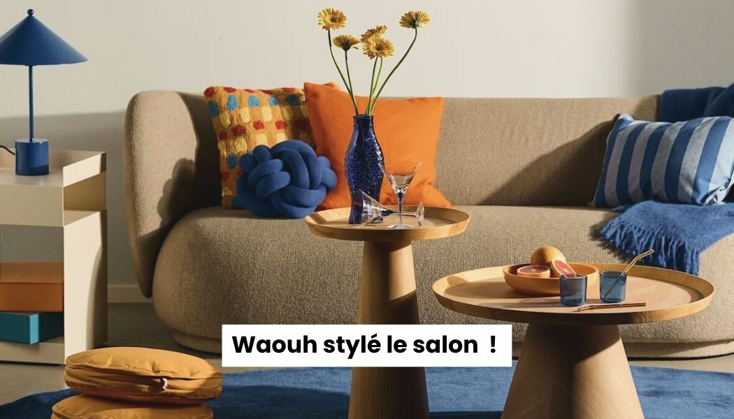
You know that moment when you're scrolling through Instagram or Pinterest, and you come across an interior so stunning that you think, "How do they make it look so good?" 😍
Spoiler alert: it's not (just) a question of budget. It's mainly a question of well-chosen colors .
And indeed, 2026 marks a real turning point in interior design. The reign of sleepy gray, white, beige, and other tones that dominated our homes for… let's say, at least five years (let's be honest, we were all starting to get a little tired of it). This year, interior design experts worldwide agree: we're embracing colors with character, colors that tell a story, colors that make us feel good.
So if your apartment still looks like an Ikea showroom, 2018 version, take a deep breath, because we're going to explain everything about the trendy colors for decorating that will enhance your home in 2026. No hassle, no need to repaint everything this weekend, and above all, no need to transform your living room into a psychedelic rainbow (promise 🌈).
Why We All Need New Colors (And Fast)
Before diving into the colours themselves, let's talk for two minutes about why 2026 is really a game changer.
Do you remember sage green? That color we saw in all Your aunt's kitchens, bathrooms, bedrooms, and even her toilet for the past three years? Well, that's exactly the problem. We've seen certain colors so many times that they've lost all their magic. These days, when we walk into an apartment with sage green, we think, "Oh yeah, Pinterest 2022, I know that one," rather than, "Wow, that's beautiful!"
The same goes for light gray. For years, it was THE "neutral and chic" color. Except, let's be honest, a light gray wall in a poorly lit apartment looks more like a hospital waiting room than a cozy haven. And we won't even mention pristine white, which is impossible to keep clean as soon as you have a normal life (a cat, children, or just the habit of eating on the sofa 🍕).
So what's the trend this year? Bold colors. Colors that They create an atmosphere . Colors that make you think, when you come home, "Ahhh, this really is home." And that's perfect, because the major names in interior design (WGSN, Pantone, Dulux Valentine…) all agree on the colors that will define 2026.
💎 Transformative Teal: The Color Everyone Will Be Talking About 🌊
We'll start with the absolute star of the year: the Transformative Teal . It's the official color for 2026 according to WGSN and Coloro, the two major players that define global trends. And frankly, when you see it, you understand why.
Imagine a deep blue-green, somewhere between the Pacific Ocean and a rainforest after the rain. It's sophisticated, it's soothing, and above all, it has a real personality . Unlike sage green, which had become too consensual (and was seen everywhere), Transformative Teal brings real depth to a space.
What's crazy about this color is that it's Like a chameleon . In the morning, when natural light enters, it leans more towards blue. In the evening, with warm lighting, it reveals its green undertones. It's like having two colors in one, creating an atmosphere that evolves throughout the day.
In a living room, painting the wall behind your sofa in Transformative Teal instantly creates an ultra-chic focal point. Pair it with golden brass (lamps, handles, picture frames) and dark wood like walnut, and you get that sophisticated, natural mix that makes all the difference. In a bedroom, painting all the walls (yes, all of them!) in this color creates a true haven. It might be surprising at first, but after a few days, you won't want to leave. Promise.
However, a little friendly advice: test it on ONE wall first before tackling the whole room. This color has character, and depending on the lighting, it can look different. Buy a small tester pot, paint a 50x50cm square, and observe it for 2-3 days at different times of day. If you still love it? Go for it!
If you want to adopt this color without repainting everything, start with... ceramic vases in this shade. Place 2-3 on a console or coffee table, add some dried branches, and boom: you've captured the spirit of 2026 without overthinking it.
🔥 Terracotta: The Heartwarming Comeback 🍂
Terracotta is making a big comeback, but wait, we're not talking about the garish orange of the 70s (don't worry). This is a modern, soft, almost powdery terracotta. A color that evokes holidays in Tuscany, sunsets, and that feeling of warmth that envelops you as soon as you step through the door.
The great thing about terracotta is that it literally blends with Everything . Light wood? Perfect. Dark wood? Even better. Touches of off-white? Sublime. Matte black? Utterly sophisticated. It's one of those colors that works well with others, and that's exactly why it's making a strong comeback this year.
In a kitchen, a terracotta wall behind open shelving or on a central island instantly creates that Mediterranean ambiance seen in magazines. But the real secret of terracotta is using it In small touches . Cushions on the sofa, a throw on the armchair, a few decorative candles in terracotta containers on the coffee table. The effect is immediate without being oppressive.
There's something deeply reassuring about this color. It evokes nature, the earth, authentic materials. In a world that's moving faster and faster, having a color in your home that brings you back to what's essential is no small thing. By the way, if you love natural atmospheres and objects that last, take a look at our article on Durable everyday objects . Terracotta goes perfectly with this decorating philosophy.
A winning combination every time: terracotta + light wood + beige linen. It's the equation for effortless chic, that vibe where you feel like you're on permanent vacation while still looking ultra-stylish. Add a few decorative objects Choose these tones carefully, and your living room instantly becomes the place where everyone wants to hang out.
🌊 Baby Blue: The Freshness We've Been Waiting For 💙
Sky blue is making a big comeback, and frankly, it's about time. We're talking about a light, almost celestial blue, with that touch of vintage 2000s vibe, but in a grown-up, sophisticated version. It's the color that opens up space, that makes it feel airy, that brings that softness we all need.
What's magical about baby blue is its effect on the perception of space. In a small apartment (and if you live in the city, you know what I'm talking about), this color visually enlarges the rooms. It creates an illusion of air, higher ceilings, and lightness. It's almost as if your walls are getting a breath of fresh air.
In the bedroom, baby blue is the recipe for restful sleep. This color has something inherently soothing about it; it slows the heart rate (yes, it's scientifically proven). Paint your room baby blue, add natural linen bedding, a few Soft lamps , and you create that cocoon where you want to stay for hours under the covers, even on a Monday morning.
In an office, this color promotes concentration while avoiding the "cold factory" feel of gray or pure white. It keeps the mind clear without being sterile. It's the perfect balance between "I have to work" and "I'm not going to lose it." If you're looking to optimize your workspace, we also have a complete guide on [website/platform name]. original office accessories which match this color scheme perfectly.
Baby blue also works incredibly well in the Small spaces . If you live in a studio or a one-bedroom apartment, this color will become your best friend. It doesn't visually overwhelm the space, it creates continuity, and it gives the impression that the walls recede. Magic for gaining a few square meters visually without having to push out the walls (which, let's be honest, would cost significantly more than a can of paint).
Chocolate Brown: The Elegance We Had Forgotten 🍫
Brown is making a triumphant comeback in 2026, completely replacing black as the sophisticated neutral color. We're talking about a deep brown, almost 70% dark chocolate, with a richness and visual appeal that instantly warms up a space.
For years, when people wanted to create a "chic" atmosphere, they turned to black or charcoal gray. The problem? It can quickly become cold, even downright oppressive. Chocolate brown, on the other hand, retains all the sophistication of black but with added warmth. It's elegant without being inaccessible, deep without being dark. It's the perfect balance between luxury and comfort.
In a living room, an entire wall painted in chocolate brown creates that dramatic effect you see in New York lofts or Parisian apartments featured in magazines. It instantly adds character, even if your apartment dates back to the 90s and you still have the original laminate flooring. Combine this color with luxurious materials (velvet, leather, thick wool) and you create that ultra-cozy "lounge" atmosphere where you want to spend your evenings with a good book and a... scented candle .
In the bedroom, touches of chocolate brown (bed linens, a throw at the foot of the bed, thick curtains) create a cocoon of softness. It's the color that says, "Here, we truly relax." No excessive visual stimulation, just this invitation to well-deserved rest. Moreover, if you're looking to transform your home into a true haven of peace, check out our article Staying home is no longer a plan B will give you plenty of additional ideas.
The secret with chocolate brown is not to be afraid of color. Yes, it's dark. Yes, it makes a statement. But that's precisely what's so great about it. In a world where everyone plays it safe with beige and off-white, daring to paint a chocolate brown wall is a way to assert your personality. And believe me, your guests will love it.
🌿 Olive Green: Much More Interesting Than Sage Green 🪴
Green remains a safe bet in interior design, but we're moving from sage (too ubiquitous, too mainstream, too "oh yeah, I saw that at my sister-in-law's") to olive. And here, we're talking about a deep, slightly greyish green, reminiscent of Mediterranean olive groves, serene nature, that connection with the outdoors we're all trying to rediscover.
What's great about olive green is that it has this ability to create a plant-like atmosphere. without Whether you need to transform your living room into an urban jungle (although frankly, plants are cool too), it's a color that breathes, that evokes nature, but with real sophistication. Where sage green had become too "tame," olive green has character.
In the kitchen, this color on the cabinets or a section of wall creates that connection with nature we all seek in the room where we prepare our meals. There's something profoundly fitting about having green in a space dedicated to food, to life. Pair it with brass (handles, faucets, shelves) and you get that elegant mix seen in the most stylish kitchens on Instagram.
In a living room, olive green is used in touches (via textiles, etc.) Plant pots and cushions bring a welcome freshness without overwhelming the space. It's perfect for those who want a touch of color but aren't quite ready to repaint everything. Start small: a large olive-shaped vase on the console table, a few cushions on the sofa, perhaps a well-placed throw. Observe how it works with your natural light and existing furniture. And if you like it, you can always take it further.
To complete your plant decor, feel free to add a few unusual objects which will really make the difference. Because in the end, it's often the small details that transform an ordinary interior into a space with real personality.
🔮 Deep Violet: For Those Who Truly Dare 💜
Now we're entering the territory of the bold. Deep purple (which leans towards indigo or plum depending on the light) is THE surprise of 2026. It's an unexpected color that challenges conventions and provokes a reaction. And that's precisely why it's so brilliant.
Purple has always been a somewhat controversial color in interior design. Too laden with history (royalty, luxury, spirituality…), too “strong” for some. But in 2026, it's being embraced precisely for that reason. Because it stimulates creativity, because it adds a touch of mystery, because it instantly creates that “wow” effect when someone enters the room.
In a living room, a single deep purple wall (and just one, mind you, let's not get carried away) creates a dramatic effect that completely transforms the atmosphere. It's theatrical, it's assertive, it's a "yes, I dared, so what?" statement. Combined with touches of gold or silver and off-white for balance, it becomes downright magical.
In a creative office, purple is your ally. This color literally stimulates the imagination (again, it's scientifically proven). If you work in a creative field or simply need a space that inspires you, a few touches of purple can really make a difference. A word of caution, though: we're talking about touches, not repainting the entire space. One wall, a few decorative objects, some cushions… start small and adjust as you go.
For a teen's room that's tired of overused powder pink or navy blue, a deep purple in a modern and minimalist version is perfect. It feels mature without being boring, and has character without being garish. Add a few Graphic posters , a well-placed string of lights, and you create that "Instagrammable" space that all teenagers dream of.
Ochre and Amber: Sunshine Even When It Rains ☀️
We finish with the shades that bring... light Ochre and amber. These warm, golden yellows have the magical ability to brighten even the darkest rooms. If your apartment faces north and you despair of seeing more than two hours of natural light a day, these colors will change your life.
Ochre is that earthy hue that evokes the south of France, sunflower fields, and that summer warmth we want to capture all year round. Amber is its more golden cousin, tending towards honey, and it captures and reflects light like no other. Together, they instantly create a warm, welcoming, and sunny atmosphere.
In the kitchen, these colors work incredibly well. A few touches through the dishes displayed on open shelves, and decorative objects With careful selection, perhaps an accent wall if you're truly convinced. The advantage is that even in the dead of winter when it's gray outside, your kitchen retains that brightness that puts you in a good mood from the moment you have your morning coffee.
In a living room, ochre and amber blend perfectly through textiles. Honey-colored cushions on a neutral sofa, an ochre throw on the armchair, a few candles in amber containers on the coffee table. The cumulative effect of all these touches creates that cozy-yet-bright atmosphere which is exactly what we look for in a living space.
In a child's bedroom, ochre brings cheerfulness without being aggressive like a bright yellow can be. It's stimulating without being disruptive to sleep, joyful without being garish. The perfect combination for a space that needs to be both a place for play and rest.
If you want to create a truly warm and bright atmosphere, combine these colors with the right objects. Our guide on decorative objects 2026 will give you plenty of ideas to finalize your project.
How to Adopt These Colors Without Turning Your Apartment into a Carnival 🎯
OK, now that we've reviewed all these amazing colors, the real question is: how do we incorporate them without it looking like a rainbow has exploded in your living room?
Because it's all well and good to be drawn to Transformative Teal, Terracotta, AND Deep Violet, but if you throw them all together without thinking, you'll end up with an interior that gives you a headache. And believe me, I've seen people make that mistake (and regret it very quickly).
The golden rule in decorating, the one that all professionals use, is what we call the The 60-30-10 rule . And it's really simple to understand:
The 60-30-10 Rule (your best friend):
- 60% → Dominant color (off-white, beige, cream)
- 30% → Secondary color (one of the trendy colors)
- 10% → Accent color (to spice things up)
So what does that actually look like? Imagine your living room. Your walls are off-white (that's 60%), your sofa and cushions are terracotta (30%), and you have a few touches of olive green with a throw and some... decorative objects well chosen (the 10%). Result: a balanced, modern interior that breathes, and that doesn't hurt the eyes after 5 minutes.
If you're unsure of yourself, start Really small . Buy a few cushions in your favorite color. Put them on the sofa and live with them for a week. Still love them? Add a throw. Still good? Maybe a vase or two. The advantage of this "baby steps" approach is that if you change your mind, you haven't repainted the whole apartment for nothing. And incidentally, it doesn't cost an arm and a leg.
Another strategy that works really well is the Accent wall . Instead of repainting the entire room in your new favorite color, choose ONE strategic wall. In the living room, it's often the wall behind the sofa. In the bedroom, the wall behind the headboard. In the kitchen, the back wall or the one with your backsplash. A single colored wall creates a strong focal point, structures the space, and allows you to use a bolder color without it becoming overwhelming.
For those who are really comfortable with color (and have a well-lit room), there's the technique of color draining which is all the rage right now. The idea? Paint EVERYTHING the same color: the walls, the ceiling, sometimes even the woodwork. It creates total immersion, an ultra-cocoon-like effect. But be warned, it works best with calming colors like Transformative Teal, Baby Blue, or Olive Green. If you try it with red or deep purple, you'll likely go crazy after two days.
Associations That Work (Because Yes, Some Colors Get Along Better Than Others)
Now that we've talked about strategy, let's talk Colour combinations . Because beyond quantity, it's also (and above all) a question of harmony.
Transformative Teal, for example, loves golden brass. Seriously. Add touches of brass (lamps, frames, furniture handles) to a room with Transformative Teal, and you create that sophisticated-yet-natural mix that's right on trend. Add dark wood like walnut and natural linen, and you have the recipe for an interior you might see in Architectural Digest.
Terracotta, on the other hand, gets along well with just about everyone (it's the nice guy in the group). With light wood, it creates that super cool Scandinavian-Mediterranean vibe. With creamy white, it remains soft and inviting. With olive green, it evokes those landscapes of the South of France that we all love. It's an easy color, forgiving of mistakes, and adaptable.
To maintain its fresh and airy feel, baby blue needs to be paired with pure white, very light natural wood, or pearl gray. If you start mixing it with overly warm colors, you'll lose the lightness that makes it so charming. Keep it in light color combinations, and it will reward you a hundredfold.
To avoid being too dark, chocolate brown is best paired with rosy beige, cream, or golden touches that break up the depth. It's a bit like seasoning a dish: you have to find the right balance between rich and light.
Olive green and terracotta together are a perfect match. These two colors complement each other, enhance one another, and create that sophisticated, nature-inspired ambiance that's so popular right now. Add brass and beige linen to complete the look.
Deep purple needs room to breathe. Pair it with plenty of off-white, very light gray, and a few touches of silver rather than gold. Gold with purple can quickly become "too much," whereas silver maintains a certain cool elegance that balances the warmth of purple.
Ochre and amber work beautifully with crisp white, olive green, and terracotta. In fact, all these warm, natural colors harmonize perfectly. It's the quintessential Mediterranean palette, one that evokes sunshine, warmth, and holidays, transforming your apartment into a place where people want to spend time.
Objects That Change Everything (Without Having to Get Out the Paintbrush) 🛍️
Let's get down to brass tacks now. Because it's all well and good to know the trendy colours, but if you don't know where to start, it's pretty much useless.
The good news is that you don't need to repaint everything to adopt these colors. In fact, often the best interiors are those that incorporate trends through... objects that can be changed Easily. Cushions, throws, vases, candles, frames… all these little elements which, put together, create a real atmosphere.
In the living room, start with the Vases . Two or three ceramic vases in colors like Transformative Teal, terracotta, or olive green, strategically placed on your coffee table or console, instantly create a visual focal point. Add some dried branches or a few flowers, and you have that touch of natural chic that makes all the difference.
THE Candles are the ultimate easy decorating hack. Group three to five of varying heights in complementary colors (terracotta, olive green, and ochre, for example) and place them on a coffee table or sideboard. Even unlit, they create an eye-catching arrangement. Lit, they add that cozy atmosphere we all crave in the evening after a long day.
Textiles are your best friend when it comes to testing out a color. You can change cushions every six months if you feel like it. The same goes for a throw. It's the minimum investment for maximum visual impact. Can't decide between baby blue and terracotta? Buy a few cushions in each color and alternate them depending on your mood. You'll quickly see which one you truly prefer.
THE decorative lamps In trendy colors, it's the winning combination of light and color. A baby blue or ochre lamp in a dark corner of your living room completely transforms the atmosphere. It brings softness and warmth, and creates those little islands of light that make a space truly inviting.
For the bedroom, change your bedding. Seriously, the impact of a baby blue or terracotta duvet cover is amazing. It completely transforms the atmosphere of the room for a very reasonable investment. Add a few bedside lamps in the same style, maybe a matching rug, and your bedroom will become the cozy haven you've always dreamed of.
In the kitchen, decorative tableware works wonders. A few terracotta or ochre plates displayed on open shelves instantly create that "chef's kitchen" feel, even if all you know how to make is pasta carbonara. Add a few amber glass jars to store your dry ingredients, and you have that dreamy modern-vintage kitchen.
For the office, the colorful accessories They really change the relationship we have with our workspace. A baby blue pencil holder, an olive green organizer, a terracotta desk lamp… it transforms a dreary office into a space where we almost want to work (almost, mind you, let's not exaggerate).
And for all spaces, the decorative objects Those that are a little unusual, those that have real personality, that's what makes the difference between a "pretty" interior and an interior that "truly reflects you." Because ultimately, that's the goal: to create a space that tells your story, not one from a catalog.
If you have a For small spaces , opt for small objects in bold colors. This creates personality without visually cluttering the room. A few small, colorful vases are better than one large, neutral item that takes up unnecessary space.
🎨 Our Top Picks for Adopting These Colors (Without Breaking the Bank)
Okay, I've talked about theory and strategy, but practically speaking, where do I start? Let me show you some pieces that we love at Petit Dénicheur and that perfectly embody these trendy colors.
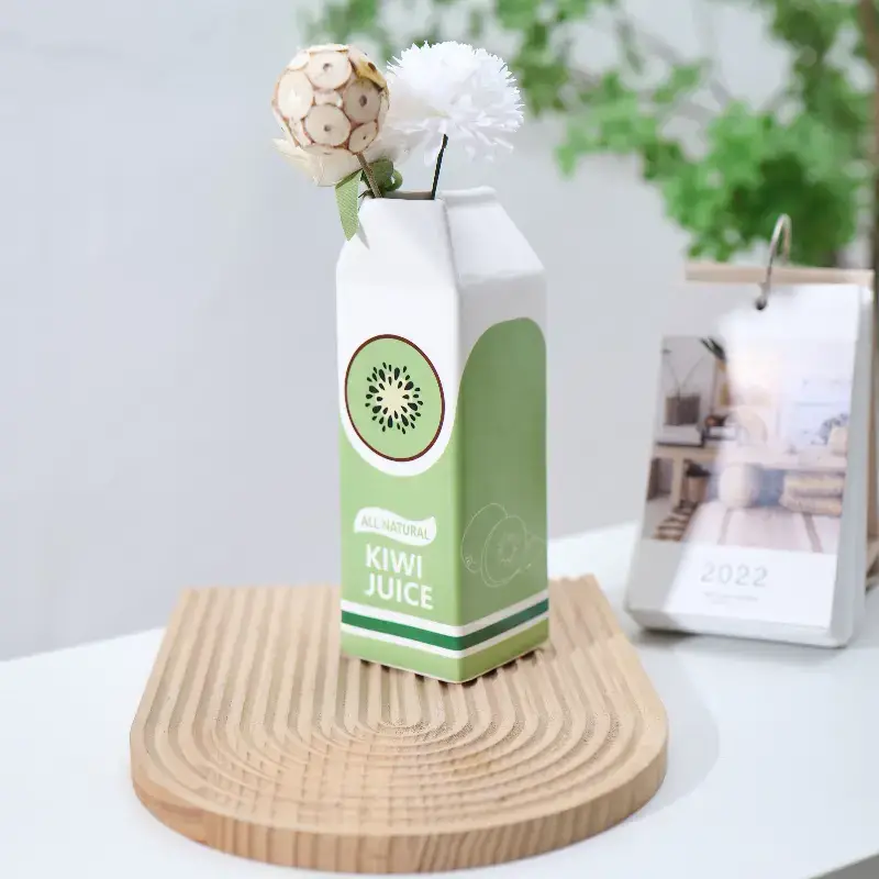
The Kiwi Brick Ceramic Vase (€28.90) – It's exactly the shade between olive green and a softer green that we're looking for right now. Placed on a console or coffee table with a few dried branches, it instantly creates that sophisticated, natural focal point. The milk carton shape adds that retro-modern touch that makes all the difference. Honestly, it's the kind of piece that makes your guests say, "Oh, that's so pretty, where did you find it?"

The Vase Strawberry Brick Ceramic (€29.90) – For those who want to embrace terracotta without falling into the cliché of raw, unglazed earth. This pinkish-terracotta shade is perfect for creating a soft and warm atmosphere. Group two or three pieces with other objects in natural tones, and you have the recipe for a harmonious decor that exudes calm.

Waterproof Design Paper Vases – Now this is truly original. These paper vases (yes, paper, but waterproof, we promise!) come in a whole host of colors and patterns. The Mediterranean Seashell Vase or the Fish Vase (€31.90 each) add that quirky, artistic touch that transforms a simple bouquet into a real decorative display. And the bonus? They're foldable, so they're super easy to store or give as gifts.

or (€75 instead of €89!) – The ultimate combination: light + natural color + plant stand. This hybrid piece brings warmth (literally with the light, and visually with the bamboo) while remaining functional. Perfect for creating those luminous islands I mentioned earlier, especially in slightly dark corners that need brightening up.

The Bust of David (€14.90) – For those who want to add an artistic touch without taking themselves too seriously. This small, off-white bust works incredibly well as a plant pot cover (yes, you put your plant in its head, it's intentional). It's the kind of object that brings a smile while remaining chic, and fits perfectly on a shelf or desk.
Our Ready-to-Shop Color Combos 🛍️
Because putting together a color palette can be intimidating, here are two combinations we've tested that work every time:
"Mediterranean Warmth" Combo (approximately €90)
- Strawberry Brick Ceramic Vase (soft terracotta)
- Kiwi Brick Ceramic Vase (olive green)
- 2-3 candles in ochre tones
- Result: An earthy-natural palette that instantly warms up your space
"Sophisticated Nature" Combo (approximately €80)
- Seashell Paper Vase (blue-green tones)
- Kiwi Ceramic Vase (olive green)
- A few decorative objects natural wood
- The result: A nature-artistic mix that feels very much like a "magazine apartment".
The little secret to making it work? Don't put all your objects in the same place. One vase on the entryway console, another on the living room coffee table, a third in the kitchen… They create visual continuity throughout your apartment without cluttering any space. This is what's called the "common thread" in decorating, and it's exactly what makes the difference between "I bought some pretty things" and "I have a truly thoughtful decor."
👉 Discover our entire collection Vases & Plant Pots – Dozens of models in all the trendy colors, from €14.90 to €75. And a nice little reminder: Get 10% off your first order with the code WELCOME10 Free delivery on orders over €69! 📦
Mistakes Everyone Makes (And How to Avoid Them)
Okay, now that we've seen what needs to be done, let's talk about what... You absolutely must not do that . Because I've seen enough failures to be able to spare you the same hassles.
The first mistake is wanting ALL the colors at once. I mentioned 7 trendy colors, but that doesn't mean you have to use them all in your living room. Choose a maximum of 2-3 colors (in addition to your neutrals), and stick to them. An interior is like a story: if you introduce too many main characters, no one can follow along.
The second mistake is forgetting about neutrals. In the excitement of using bold colors, some people end up with Transformative Teal on one wall, terracotta on another, purple on a third… and in the end, there's no rest for the eyes. Neutrals (white, beige, cream) are what allow colors to breathe, to reveal themselves. Without them, you just have visual noise.
The third mistake is neglecting the natural light in your space. If you have a room that's already dark and faces north, and you paint it chocolate brown or deep purple, you'll create a cave. Not a cozy haven, a cave. There's a difference. In dimly lit rooms, opt for baby blue, ochre, or light touches of color rather than a completely dark look.
The fourth mistake is buying paint without testing it. Colors ALWAYS appear differently depending on your lighting, exposure, the color of your floor, your furniture… What looks magnificent at your neighbor's house can be a disaster at yours. Invest in testers, paint small sections, and observe the results over several days at different times of day. It's a pain, but it's really worth it.
And the fifth mistake, probably the worst, is copying and pasting from Pinterest. You stumble upon a stunning photo of a living room with terracotta tiles everywhere, and you want THE SAME THING. Except your apartment isn't the same size, doesn't have the same light, and doesn't have the same architectural style. What works in a 200-square-meter New York loft with 4-meter-high bay windows might not work in your 50-square-meter apartment with standard windows. Be inspired, but always adapt it to your own reality.
What's Really the Most Important Thing?
We're nearing the end of this article (thank you for sticking with it this far!), and if I had to summarize the key takeaways in one sentence, it would be this: Trendy colours are invitations, not obligations .
You don't have to go for Transformative Teal if you find it too much. You have the right to hate deep purple (I'm not a huge fan myself). You might love terracotta but find chocolate brown just not your thing. And that's OKAY.
Ultimately, decorating isn't about blindly following trends. It's about creating a space where You feel good . A space that reflects you, that soothes you when you come home in the evening after a shitty day, that inspires you when you need to create, that comforts you when you need it.
The colors I've shown you are trendy because they address a collective need in 2026: a need for warmth, nature, authenticity, and colors that make us feel good. But if baby blue stresses you out instead of calming you, move on to something else. If olive green brings back bad memories, forget it. Your well-being comes before any trend.
However, if one of these colors really speaks to you, if you see it and think, "Damn, yeah, that's exactly what I want in my home," then go for it. Start small if you're afraid of making a mistake (that's why I emphasized decorative objects), but go for it anyway. Because life is too short to live in a home that doesn't reflect your personality.
And above all, remember that decorating isn't set in stone. You might love terracotta in 2026 and switch to olive green in 2027. You might start with touches of baby blue and end up repainting your entire living room that color because you fell in love with it. It's your home, your rules, your story.
Where to Start Now? 🚀
Okay, so what exactly do you do now that you've read this entire article?
First step: choose ONE color. Not three, not five, just one. The one that made you react when you read, the one you came back to several times, the one that makes you think, "Yeah, that would be cool in my house." Write it down mentally.
Second step: go take a look at our Shop . Look at vases, candles, and decorative objects in that color. Choose two or three pieces that really speak to you. No need to break the bank; start with a reasonable budget. The idea is to test the color in your actual space.
Step three: Once you've received your items, live with them for at least two weeks. Look at them in the morning while having your coffee, in the evening when you get home from work, and on weekends when you're lounging in your pajamas. Do you still like them? Do they create the atmosphere you were looking for?
If the answer is yes (and it probably will be, because we all have a pretty good intuition about what we like), then move on to the next step. Add some cushions, a throw, maybe a rug. Gradually build your color palette.
And if you are really convinced, if this color has become indispensable in your life, then yes, you can consider taking out the brush and painting a wall (or several, depending on your boldness).
The advantage of this gradual approach is that you never take a huge risk. You progress at your own pace, you adjust according to what you truly feel, and in the end, you create an interior that is truly yours.
To Go Further 📚
If this article has given you some ideas and you want to continue exploring, we have plenty of other resources that might interest you.
Our guide on small space decor is perfect if you live in a studio or small apartment and want to optimize every square meter while maintaining style.
The article on The 10 decorative objects of 2026 will give you other concrete ideas for transforming your interior without breaking the bank.
If you like pieces that are out of the ordinary, take a look at our selection. unusual objects . Because in the end, it's often these unique little details that give an interior a real personality.
And if you're looking to create a real haven where you love spending time, our article Staying home is no longer a plan B will give you plenty of ideas to transform your apartment into a sanctuary.
For those who work from home (and there are many of us), the guide to original office accessories will help you create a workspace that truly inspires you.
And finally, if you're taking a more mindful approach to consumption (and we understand), the article on durable everyday objects will show you how to invest in timeless pieces.
The Collections That Await You 🛍️
Finally, I'll leave you with our collections, which incorporate all these trendy colors. Take a look, get inspired, and above all, don't hesitate to start small.
Discover our vases and plant pots in all the trendy colors. That's often where we start, and it's rarely a mistake.
Our collection of candles and candle holders will allow you to add those touches of color while creating the perfect lighting atmosphere.
THE decorative objects Our selection includes items chosen for their ability to transform a space without overdoing it. Because in decorating, less is often more.
Our range of lighting fixtures will help you bring out the best in all these colors. Because a beautiful color without the right light is like a good dish without seasoning.
And for those looking to decorate their walls, our collection wall decor It has the power to transform any white wall into an interesting focal point.
You'll find all this (and much more) in our section Home & Decor . And don't forget: Free delivery on orders over €69 And Get 10% off your first order with the code WELCOME10 . Because embracing trendy colours shouldn't break the bank.
One Last Word 🌟
Well, we're really nearing the end now. If you've read this far, it's either because you're really passionate about the subject, or you're seriously procrastinating instead of doing what you're supposed to do (and in that case, I totally sympathize 😄).
More seriously, I hope this article has inspired you to add a little more color to your home. Because we spend so much time in our interiors, they should truly reflect who we are and make us feel good.
The trendy colors of 2026 aren't meant to put pressure on you. They're there to inspire you, to give you ideas, to show you what's possible. But ultimately, it's your home, your choices, your story.
So whether it's Transformative Teal calling to you, Terracotta warming your heart, Baby Blue soothing you, Chocolate Brown making you sophisticated, Olive Green connecting you to nature, Deep Violet inspiring you, or Ochre illuminating you… listen to your intuition and go for it.
And above all, never forget that the most beautiful decor is the one that makes you smile every time you come home.
See you soon on petitdenicheur.com ! 💙
Article written with passion by the Petit Dénicheur team
Your finder of fantastic objects 🐼
-10% with code WELCOME10 | Free delivery on orders over €69 | Fast shipping from France


